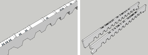
One of the main design issues for the Braille Display was, naturally, the raised dots themselves.
Braille is a character set of two columns of three dots each (a two by four variation is used for computer work, and allows 256 codes – however, to start with, I’m using the original 6 dot/64 character code). These dots have a very specific size and position, standardized to ‘about’ the following (depending on who standardized!):
- 2.5mm from dot center to dot center, both horizontally and vertically.
- 1.5mm dot width (at top – base can be wider).
- 5-7mm for each ‘cell’ (area all six dots appear), including surrounding space/padding (in other words, the space between Braille characters on a line).
- 10-14mm from row to row of characters.
As you can imagine, this tight layout makes Braille machines very interesting projects!
Of the measurements here, obviously the most important ones are the dot spacing and size. The Braille rod I created takes care of vertical (column) spacing. Composed of a single column, each rod shows all eight possible patterns on it, using 12.5mm per cell vertically. This is larger than spec, but since there is only one line displayed, not an issue.

Probably one of the easiest ways to show the rods in use is with a interactive display. In the box here you have a “bird’s eye view” of the display – two rods, and embossed with the appropriate dots. Just click on any letter to see how it will work.
|
Press a
|
|
|||||||||||||||||||||||||||||||||||
Since each rod has eight patterns on it, we simply shift the rod forward and backward under a window to position the appropriate half of the character. Because there are only eight patterns, rods don’t have to move far. In fact, the pattern on each rod is designed to put the most common character patterns near the center, so there is less motion likely in regular use (see my article on patterns). For example, the space (no dots), which occurs most often in text, is in the center of the rod, reducing travel. The location of each bit pattern is managed in the program code, so it’s simple to use a layout that promotes the most efficient (and therefore faster) display.
Another aspect of the rods are that they are reversible. If you look closely, one rod has a notch at the front, and one has it at the back. However, these are the same rods, just reversed (one for the left side of the Braille character, one for the right). The reason for this is cost: when manufacturing these out of plastic, instead of molds for two rod types, a single mold can be used for both rods, and simply flipped – computer programming can handle the rest.
One more point is the off-center dot pattern. The reason for this is that the rods themselves are thick (about 3mm) and the space between rods so high (about 1-2mm), so there needed to be some way to get the dots as close together as possible. The result is that the dots are near one edge of each rod, and by reversing the rod, the two sets of dots are as close as possible together.
Looking at the rest of the rod design, most of it is straightforward: the notches underneath for the locking ridge and the movement gear; the curved notch at one end for rod orientation identification (both visual and by touch), and the raised ridge between Braille patterns on the rod to prevent wear on the dots from movement inside the device (these ridges are slightly higher and so protect the dots).
Obviously, the acrylic versions are a poor cousin of the final rods; for one thing, I am testing not with dots but with ridges, since the laser cutter can only do 2D cutting, not 3D. Once the design is finalized, I plan to get a 3D print of the rod made, with proper dots, and some contours on the body. Another option I’d like to explore when moving to 3D is a Gray code pattern etched or cut on the rod itself, for absolute positioning. Absolute positioning means the device would know where every rod is positioned at all times, and should really speed up the device.
But of course, like many parts, that’s for the future…


I am running through the interactive alphabet with my wife, who is a native Braille reader.
“E” is 1-5, not 1-5-6. That is the only mistake she found.
Thank you for catching this – I’ve made the correction to the display.
For funding, have you taken this to any Rotary Club or Kiwanis Club chapters? Sometimes they can muster very good fund raising and can make it a regular promotion. Take your design, future projections and a prototype for an exhibit. Myself, I promote Vinux which is a Linux project aimed for the Visually Impaired. A web search will turn up several results.
Best of luck to your goal.